As a budding business owner, knowing how to write compelling copy will help you connect with your customers and boost your brand awareness.
In addition to blog posts, articles, website content, and social media copy, understanding the principles of user experience (UX) copywriting will set you apart from the pack.
Crafted the right way, these seemingly small but significant pieces of text will make it easier for your customers to access your products or services, inspire loyalty, and help your business stand out.
But what is UX copywriting exactly and how do you do it? Well, we’re going to tell you right now.
Read on to discover all you need to know to get ahead with UX copywriting.
What is UX copywriting?
Before we dig any deeper, let’s consider the meaning of UX copywriting for a moment. UX copywriting is the art of crafting words that help people navigate a digital touchpoint with confidence and clarity.
From landing and web pages to mobile apps and digital products, UX copywriting is something closely linked to design as it’s based on creating valuable experiences across various touchpoints. Often, UX copy is the smaller snippets of text (sometimes referred to as microcopy) you’ll see when navigating an app or webpage. While ‘micro’ these communications will have a big impact on your business’ success.
UX vs UI copywriting
Knowing the difference between UX and UI copywriting will help you on your quest for success. While the two disciplines cross over, the main difference is that UI copywriting focuses on the core logistical nuts and bolts (labeling and basic structuring) while UX copywriting works in harmony with the digital design of an interface to bring it to life and make it more intuitive to navigate.
The benefits of effective UX writing
Leveling up your UX copywriting game will offer plenty of business-boosting benefits—including:
- Increased customer loyalty
- Improved brand reputation and awareness
- Higher levels of engagement
- Better search engine results rankings
- Accelerated commercial growth and more profits
The 5 UX copywriting concepts you need to know
Now that we’ve answered the question, “what is UX copywriting?” you’re up to speed with the basics. Let’s look at five concepts that will make your content and communications sing.
1. Hedging
First up, we have a UX copywriting concept called hedging. Sometimes, there are situations where you have to soften your language or approach an issue with care—this is where hedging comes in.
Parts of the user journey where something negative or inconvenient happens (a payment error, an unexpected redirect, a tech issue, a botched booking, etc.) require your UX messaging to be empathetic and approachable.
If someone has experienced a booking error, for instance, you wouldn’t say “oops! haha, your booking went wrong. Try again”. Instead, you use hedging to soften the blow and guide the user to a satisfactory resolution. That said, your hedged message might look a little something like this:
“We’re so sorry, there’s been a booking error. Would you like to try again?”
This softened and decidedly empathetic message, accompanied by call-to-action buttons on how to solve the problem, will significantly increase the chances of the user sticking with your app or website and enjoying a positive experience.
The key to hedging is to match your customers’ emotional state, write with caution, and offer an empathetic solution.
2. Boosting
Next up, we have boosting. The first rule of boosting is…well, it’s that you should treat it as the exact opposite as hedging.
Again, this UX copywriting concept requires you to match the user’s emotional state. The best time to use boosted statements is when you're sharing good news or you’re working with positive situations within the user journey. You can also use this concept when you’re trying to promote a brand USP with confidence.
A well-trodden example of boosting that you may well have come across is when people quote a data-driven source in a blog post or article. When the author is being cautious with their statement (in instance when they’re not 100% sure about a source or statistic), they might use something like “the data suggests”. But, to display confidence in your convictions and inspire trust, the boosted version of this phrase would be something like “the data shows”.
The good thing about boosting is the fact that it allows you to showcase extra brand personality, create excitement, and experiment with your words that little bit more—like this:
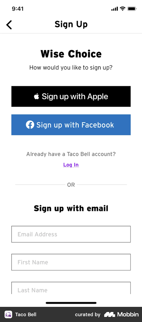
3. Squinting
A savvy UX concept that is often overlooked, squinting is more or less exactly as the name suggests. Commonly referred to as the squint test, this invaluable UX writing trick is an excellent way of checking whether the design elements as well as page copy are working together in harmony.
By looking at the screen and squinting for a few seconds, you can see which design elements and pieces of messaging stand out most. Based on the main message you’re looking to share and the primary action you want the user to take, the right pieces of copy should still be legible when you squint. If this isn’t the case, you should go back to the drawing board.
Revisiting our Taco Bell example for a moment, by performing the squint test, the page title, and ‘sign up’ CTAs are clear and concise. So, this particular screen passes the squint test. If the signup CTA copy was unclear or poorly positioned, squinting would give you the tools to make the appropriate tweaks before signing everything off.
4. Stacking
A method created to adjust user behavior when engaging with a specific screen or webpage, stacking is the art of placing a piece of content alongside (the placement could be above, below or beside the action in question) that a user might find familiar to guide them towards a new or altered outcome.
As our everyday habits are hardwired into our brains, sometimes a little finesse is required to break or change them—this is the core concept of stacking.
Say, for instance, you’re a home fitness app provider looking to know a little more about what your users think about the exercise programs you offer. Rather than adding UX copy like this:
Save your activity
Save your activity, track your progress, and share your epic efforts with the community for maximum kudos.
CTA: Save | Save & Share
You could stack an extra piece of content into the mix that compels the user to shed more light on their activity—like this:
Save your activity
Save your activity, track your progress, and share your epic efforts with the community for maximum kudos.
What was the highlight of your activity?
<*Add your text content here*>
CTA: Save | Save & Share
By stacking the highlight-based subtitle and the text input box on top of the CTA, you will inspire your users to input valuable information about their activity (the kind of feedback you can use to personalize your marketing communications and improve the user experience you offer) while making the screen itself more engaging.
5. Friction
Also known as halting, this is a technique where you create friction on purpose. Generally, friction in the user journey is negative as it slows people down and causes frustration. But, there are times when slowing your users down is pretty essential.
Applying positive friction is useful when you’re dealing with a part of the user journey where someone could do something irreversible like permanently altering their account or deleting important files or data.
When using positive friction or halting, it’s important to add clear and concise copy that will stop the user and make them consider their next decision. Getting straight to the point and bolding the most important elements of your copy or messaging will help you achieve the best results. For example:
Original:
Delete files
Are you sure you want to delete these files?
CTA: Yes | No
With friction:
Delete files?
Are you sure you want to delete these files? Pressing the delete button will get rid of these files forever and you won’t get them back. Think about it for a moment.
CTA: Delete files forever | Go back & reconsider
As you can see, the halted version of this copy highlights the permanence of deleting the files while making the user slow down and take a moment or two before making their decision. A prime example of positive friction.
Conclusion
UI is the saddle, the stirrups, & the reins. UX is the feeling you get being able to ride the horse.Dain Miller
Sharpen up your UX copywriting skills and you will not only significantly improve the experience you offer your customers across every channel or touchpoint, but you will also inspire trust and improve engagement. Use these tips to your advantage and you’ll push yourself ahead of the pack in no time.
We wish you the best of luck and for more tips on improving your user experience, discover everything you need to know about UX design.
UX copywriting FAQs
How do I learn UX copywriting?
These days, there are no end of useful online resources, explainers, and articles that will help you learn the basics of U copywriting. Our guide to the five essential UX copywriting concepts you need to know will help you get to grips with the core tips and tricks you need to improve your communications and offer a seamless experience across every channel and touchpoint.
What does a UX writer do?
Generally, a UX writer works in collaboration with UX or digital designers to craft copy that reduces negative friction, sparks engagement, and improves the user experience across various products, channels, and touchpoints.
In addition to copywriting, a UX writer conducts user research and tests content and communications to drive the best results for every key user flow or journey.
What is the difference between UX writing and copywriting?
While both disciplines involve writing copy and communications for a specific target audience, the key difference here is that UX writing is less about driving awareness or earning direct sales and much more about working with designers to create an end-to-end experience that is engaging, meaningful, and intuitive.